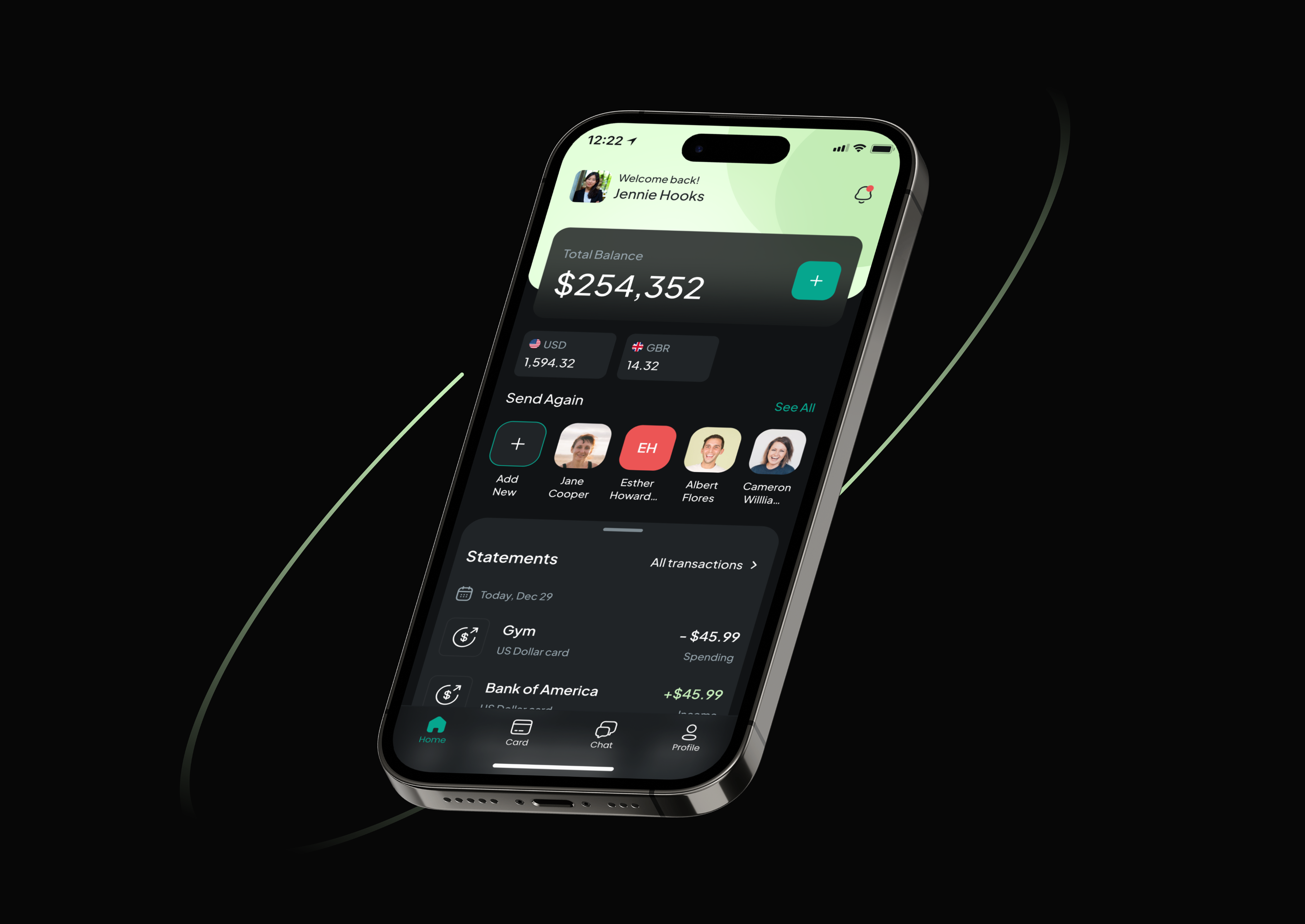
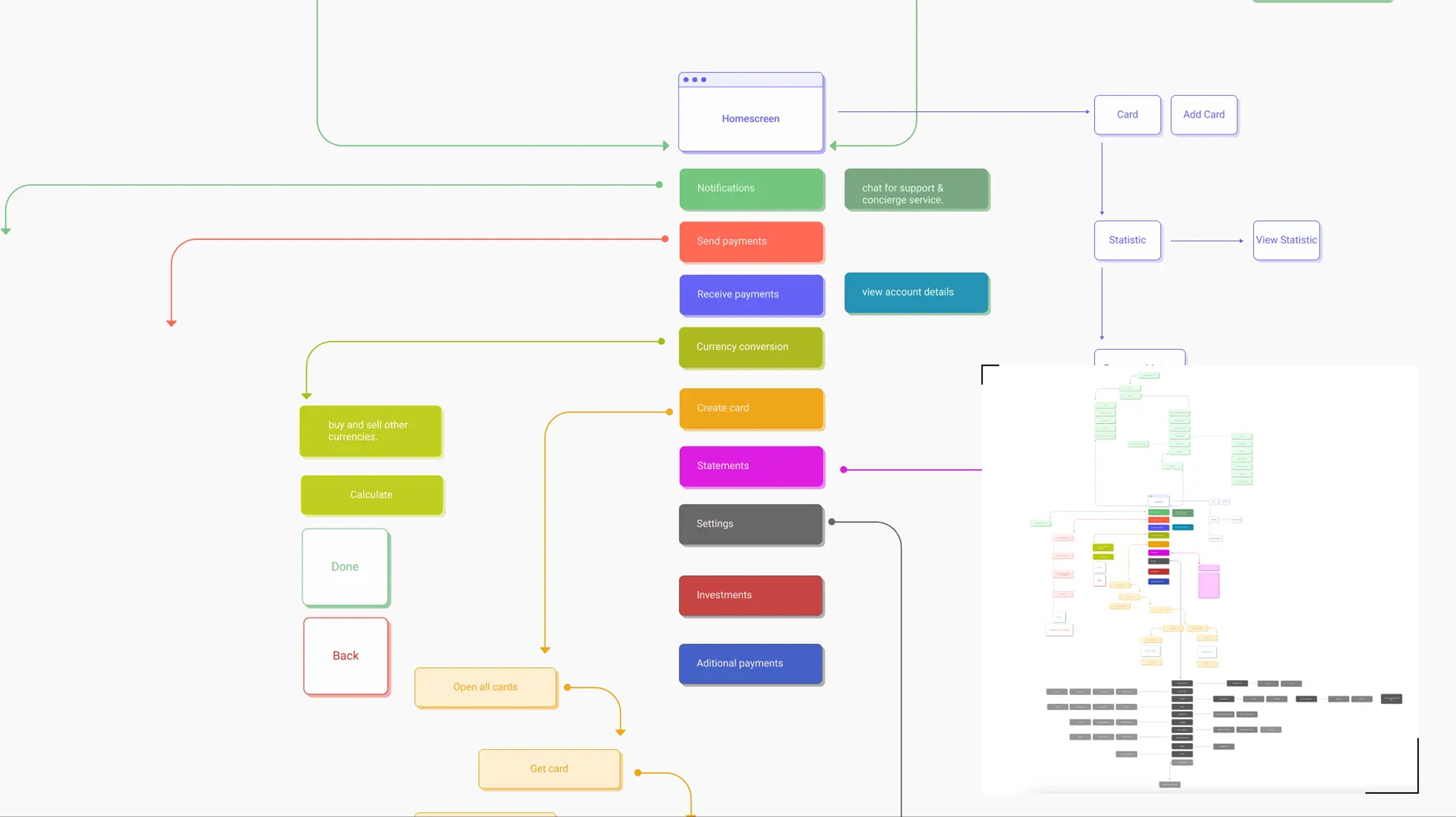
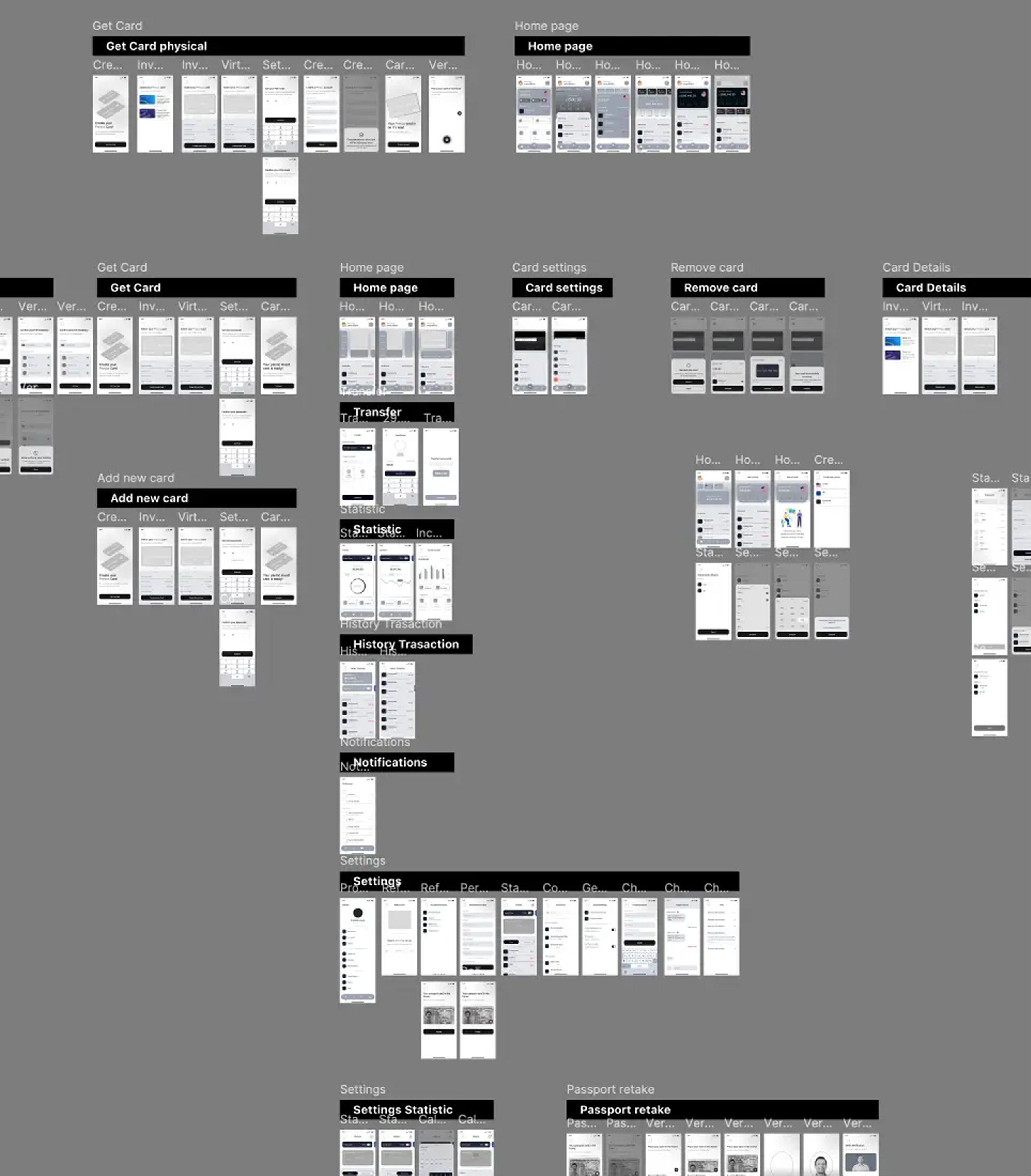
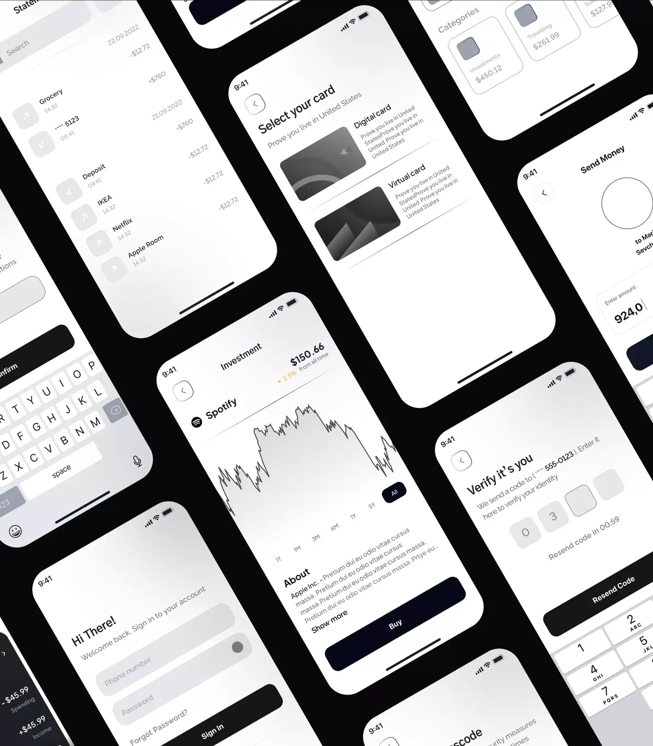
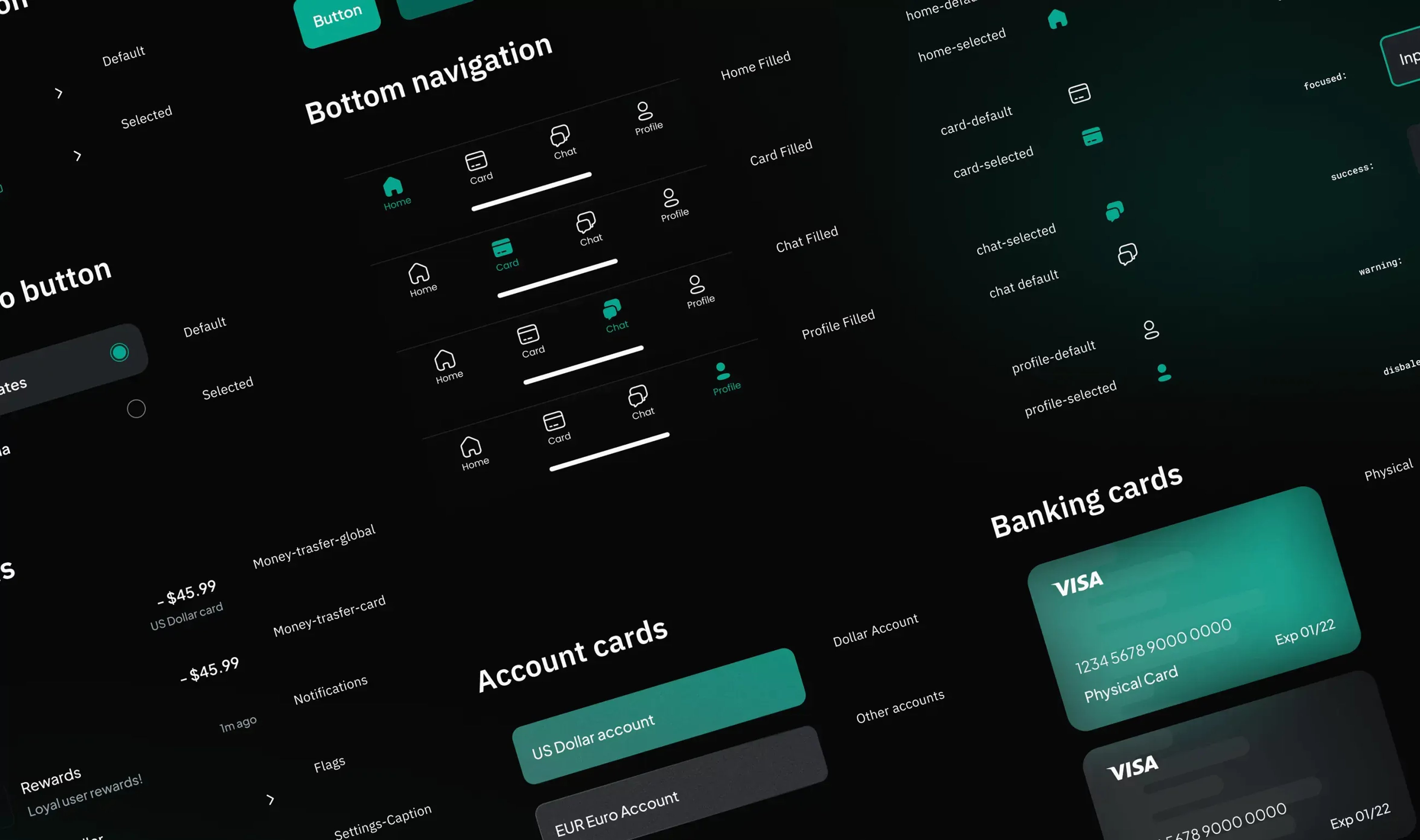
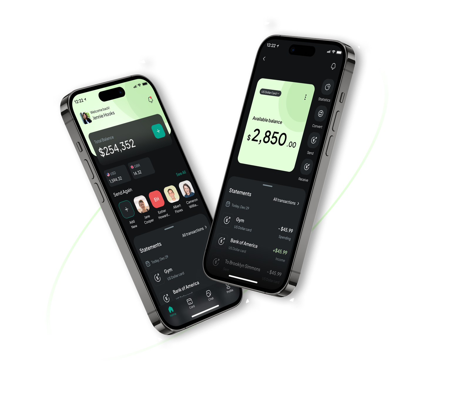
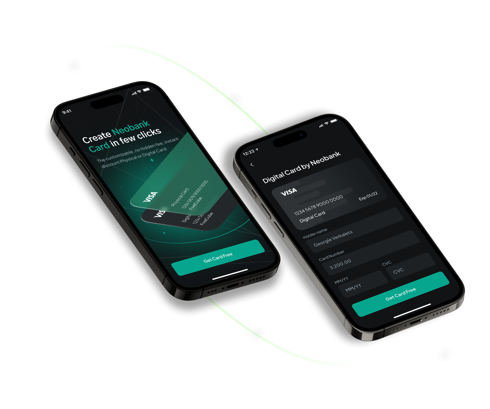
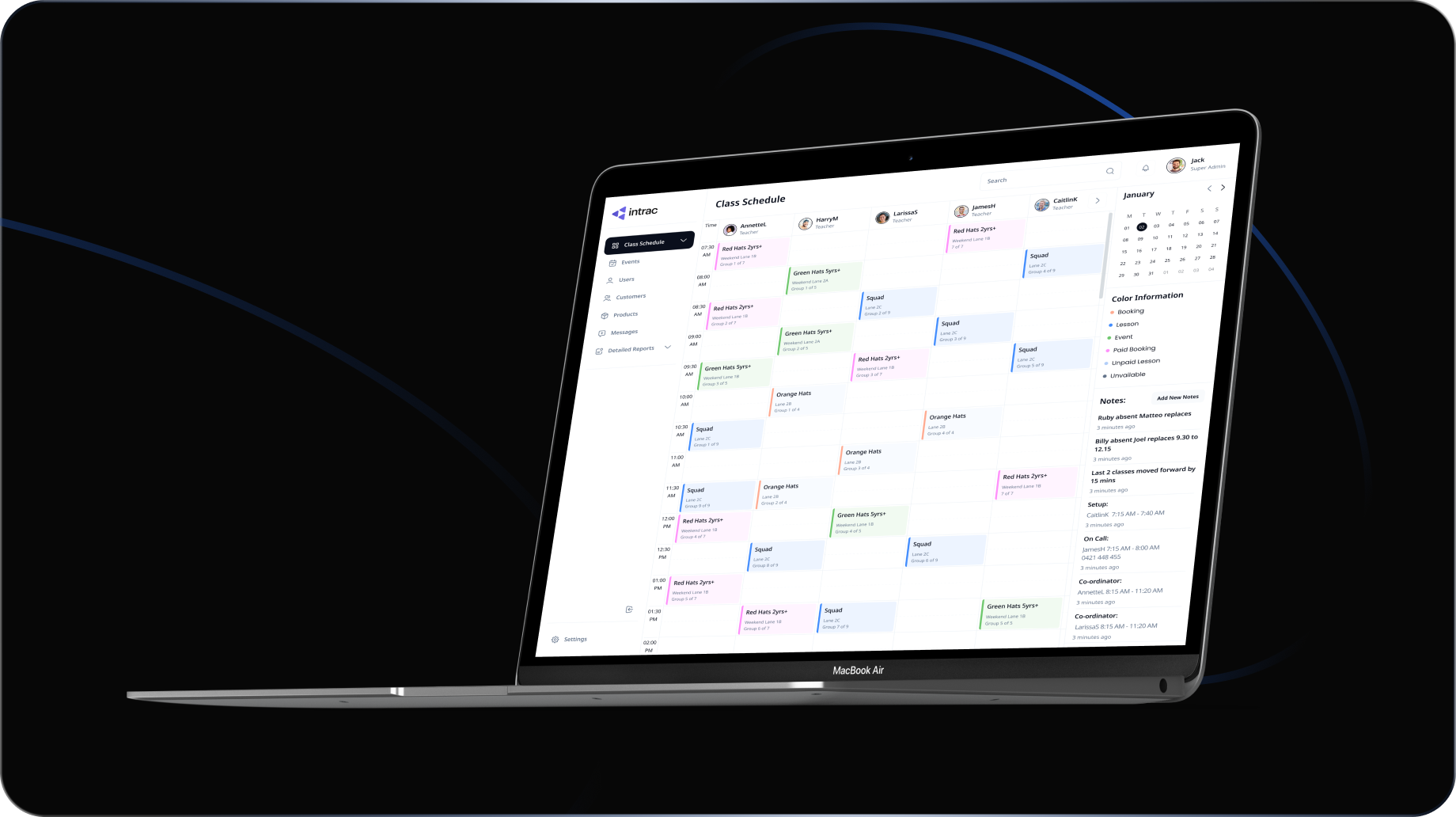
An invitation-only private wealth platform — international payments, multi-currency accounts, and wealth management in one iOS app for private clients. No existing product, no legacy patterns — I designed everything from scratch.
A private wealth platform from scratch — no existing product, no design to inherit, no analytics. The client had a vision; my job was to turn it into something a user could actually navigate.
Working solo meant owning every decision: how the flows connect, where actions live, what a user sees first. I grounded those decisions in competitive analysis — studying how leading banking and wealth apps structure their core flows — and used that to back every structural decision in client review.
The standard for a financial product is high. Every screen has to feel calm and trustworthy before a user has any reason to trust it. That's not a visual problem — it's a logic problem. Get the flow right, and the UI has something solid to sit on.
Before any wireframes, I mapped the full customer journey solo — every touchpoint, every decision point a user hits moving through the product. The CJM went to the client for review and sign-off before a single wireframe was started.
That order was deliberate. Wireframes built on an unreviewed flow create expensive rework later. Getting the journey agreed first meant wireframes could focus on structure, not re-debating logic.
Flows were wireframed in priority order — core actions first, edge cases after. Each set went back to the client before moving forward.
Every core flow was wireframed before any UI work started: onboarding, account overview, international payments, multi-currency management, savings goals — low-fidelity, no styling, no colour.
The wireframe stage was for arguing about structure: is this step necessary, does this action belong here, what happens in the empty state. A flow only moved to high fidelity once it held up in wireframes and got client sign-off.
This kept the visual design phase focused — by the time a screen was getting its final UI, the logic underneath it was already agreed.
For a financial product, visual consistency isn't polish — it's trust. A button that looks different across two screens, a balance typeset two ways, quietly breaks the confidence the product needs to project.
I built the system from scratch: colours, typography, spacing, and a component library — all defined without a brand guideline, based on competitive analysis and what the product needed to communicate. Dark theme only, designed to feel premium and calm.
Every screen was assembled from the same kit. By the time flows were in high fidelity, there were no one-off decisions — just components doing their job.

Without user testing budget, validation came from structured client review. Every flow was walked through as a task scenario — not a design presentation, but a simulation of real use.
Changes were small but cumulative: a confirmation step that added friction without clarity got cut, a balance card that buried the primary action got restructured, empty states got rewritten to suggest next steps. Each review tightened the product before a line of code was written.
A complete iOS banking app shipped — CJM, wireframes, design system, and 40+ screens — designed solo from a blank canvas.